Oxfordshire Mobility Model: MIMAS project update – April 2021
User Testing for MIMAS
MIMAS is an innovative cloud-based transport modelling solution, built by a consortium of companies. Each partner within the consortium brings their own speciality and is responsible for a different aspect of the system. This article focuses on the ongoing user testing for MIMAS and our process.
Why conduct user testing?
User testing is an essential part of any system, product or website development. It is even more crucial during a long-running project, where it can become easy to deviate from agreed scope and design over time. User testing is an exercise that aims to ensure the system is intuitive, has an easy-to-understand interface, a user-friendly experience and, most importantly, that the user is not hindered in using the tool. We chose to select users from Oxfordshire County Council as our testers and ask them to perform realistic actions, going through user journeys and providing feedback as they go.
The main objectives for the user testing were to ensure that the system was intuitive, usable, and functional. We wanted to test that the product did as expected but also use this as an opportunity to gather recommendations and make improvements before the first release and for the future.
Our process
We decided to conduct our user testing in two stages to allow for iterative improvements between cycles. We used an interview style and ‘think aloud’ approach to gather information and feedback naturally on how the user interacted with our system. Each interview started by asking a user questions about their background and experience to gather their level of modelling expertise. The purpose of this was to understand how different abilities interacted with the UI. Following this, the users conducted specific exercises and scenarios whilst talking us through their thought process, actions, and the reasons for them. This allowed us to understand why a user took certain actions, to evidence how intuitive the system is.
The user testing provided a range of positive and negative feedback which highlighted definite consistencies in some of the users’ thought processes. We used this to form a consolidated list of improvements which was prioritised and labelled according to the MoSCoW approach as “must have”, “should have”, “could have” and “won’t have” changes. This prioritisation was essential to help keep the team focused and ensure we had the most impactful changes in place before the second round of user testing took place.
Before the second round of user testing, our UI developers at Oxford Computer Consultants worked hard to implement as many of those changes as possible. By implementing the changes suggested from the first round of user testing prior to the second round, we had the opportunity to see the value of our improvements. This proved to be a useful approach as it meant less repetitive feedback for the development team and resulted in a more positive and focussed second round.
A new testing cohort was recruited for the second round, as fresh pairs of eyes to judge and test the system as a ‘new’ user to keep the two tests fair. Using the same cohort may have resulted in repetitive testing results from users who focus on the changes rather than the current system they are reviewing.
Due to the significant improvements to the user journeys and basic UI, the second round resulted in feedback focussed on modelling needs and language. This in-depth feedback has given us ideas on how to make the system more usable and helpful to the day-to-day users. The next step is for us to repeat our process of consolidating the feedback, prioritising and then implementing the changes before our Beta release.
Results
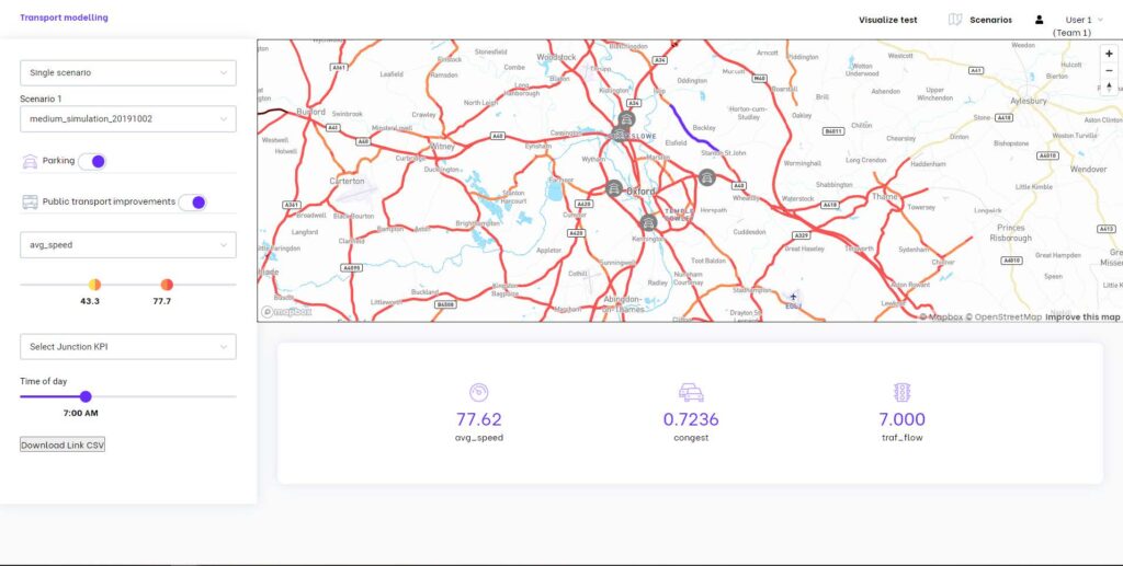
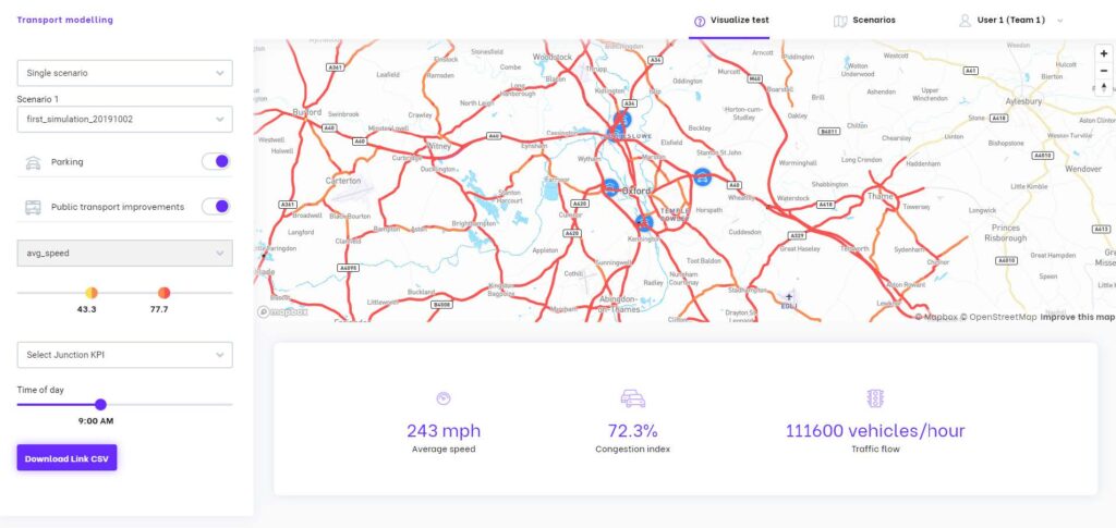
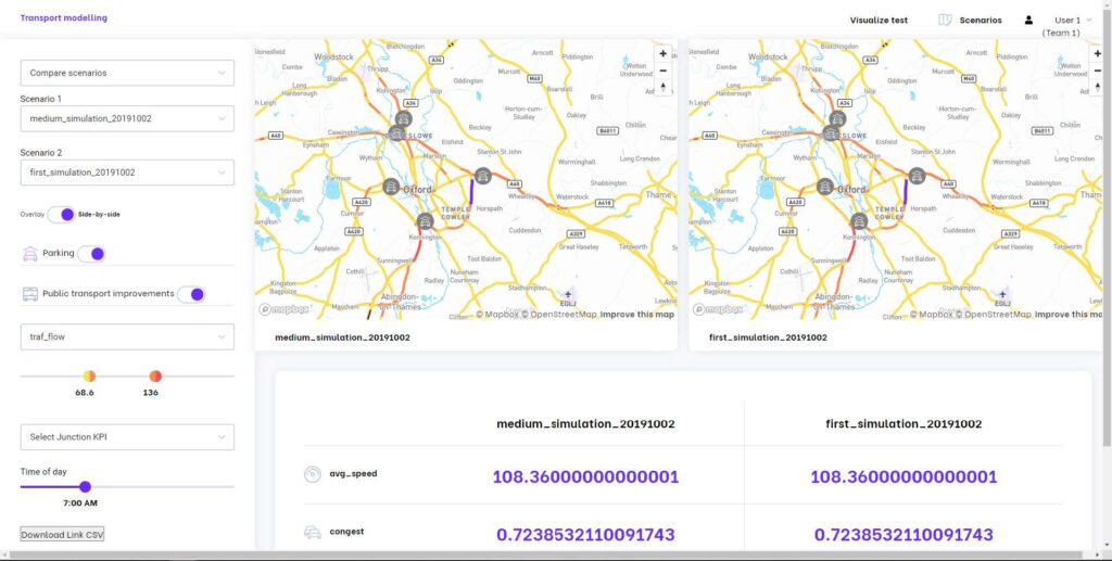
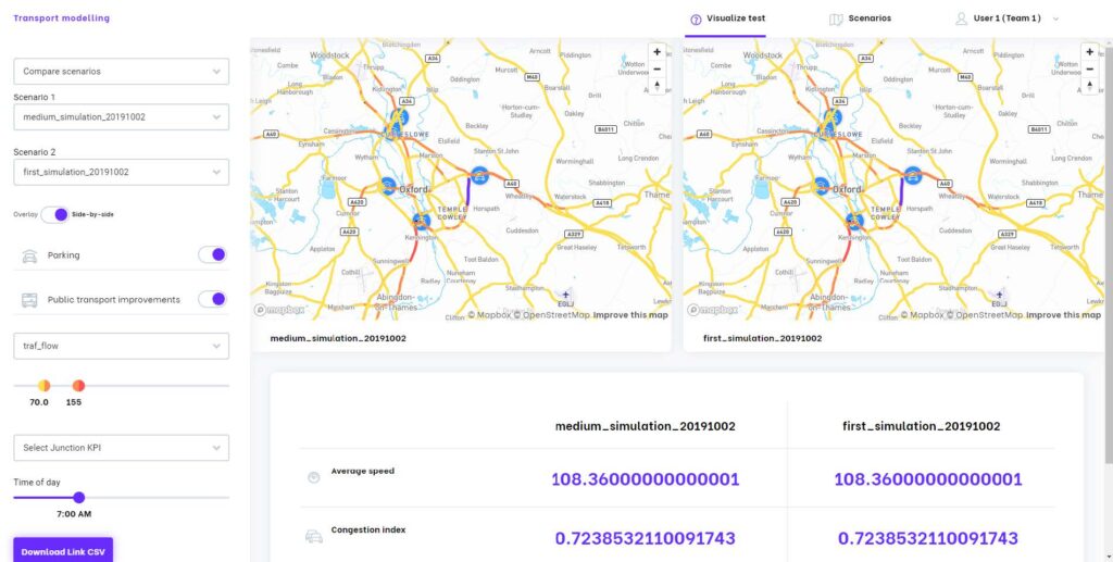
Below, you can see a few of the changes made as a result of our user testing. Please note that these improvements are still ongoing, these screenshots are only representative of the first round of user testing.
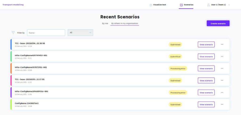
Recent Scenarios page – This has been improved by adding a navigation bar, filtering and sorting for scenarios and additional metadata alongside scenarios.
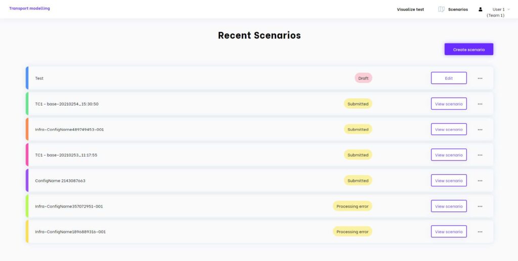
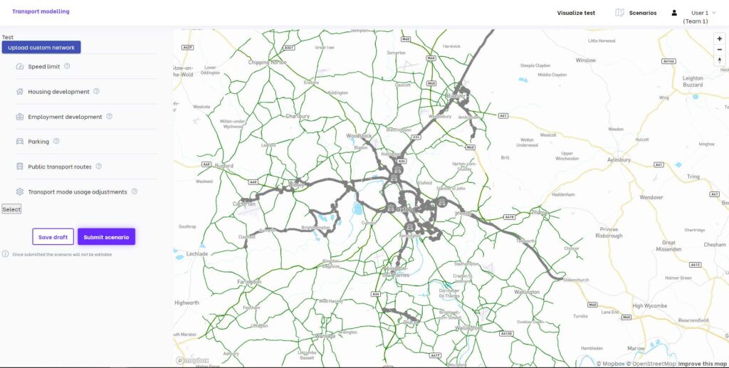
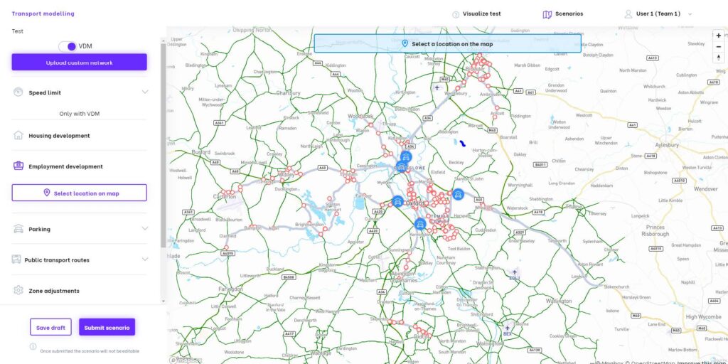
Edit Scenarios page – here you can see improvements to both the left-hand panel and the map overlay. These changes enhance the user’s understanding of how to interact with the map. You can also see design improvements to the buttons, selections and map.
Visualize page (single scenario) – We have improved the left-hand panel, and the clarity of metrics in the panel under the map, improving communication to the user.
Visualize page (compare scenario) – For this screen we have improved the left-hand panel, and the labelling in the panel under the map.
To our testers, thank you. Your time and feedback was greatly appreciated and has resulted in some extremely beneficial changes!
Table of Contents
Latest news
Oxfordshire Mobility Model: MIMAS project update – April 2021
User Testing for MIMAS MIMAS is an innovative cloud-based transport modelling solution, built by a consortium of companies. Each partner within the consortium brings their own speciality and is responsible for a different aspect of the system. This
Oxfordshire Mobility Model: MIMAS project update – March 2021
Deploying MIMAS in the cloud MIMAS is a cloud-based transport modelling solution, developed for Oxfordshire County Council by a consortium of individual companies, each bringing specialized expertise, and each being responsible for separate components of the system. Previous
Oxfordshire Mobility Model: MIMAS project update – February 2021
A Local Authority Perspective MIMAS is Oxfordshire County Council’s next generation of transport model. It is a scalable transport modelling tool designed for the move towards a self-service paradigm. This month we asked Laura Peacock, Innovation Hub Manager