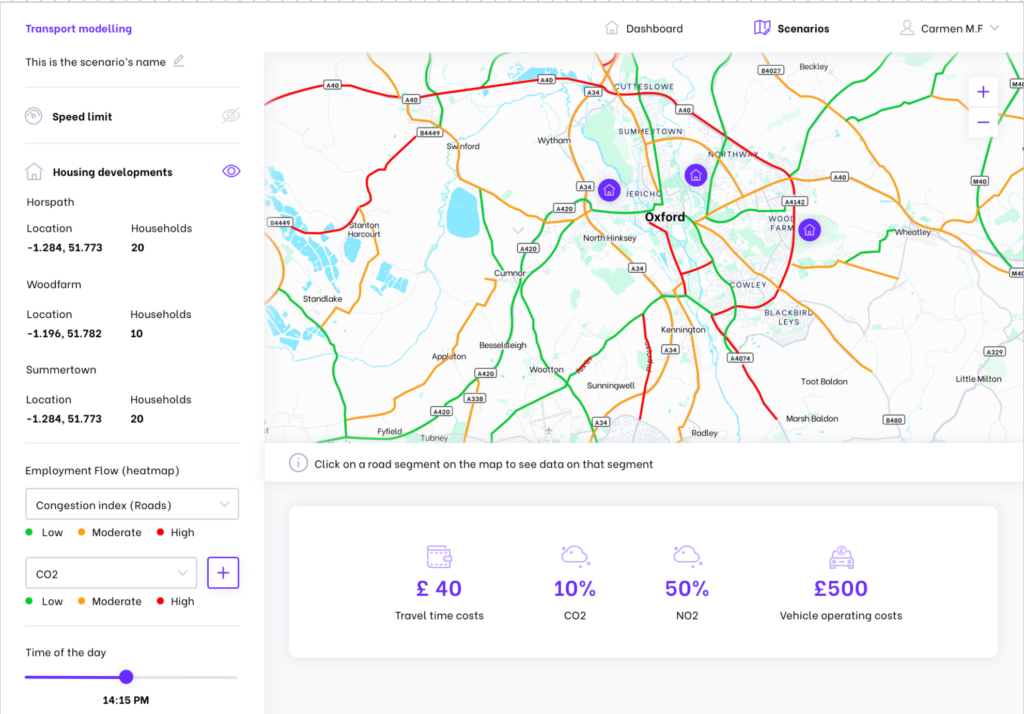
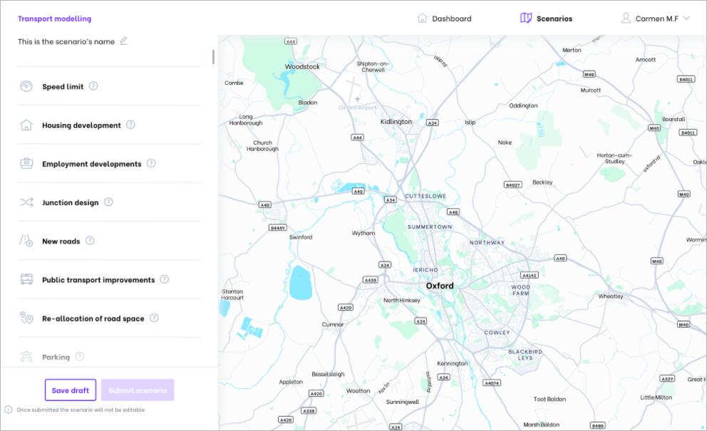
The simple user interface will allow users to build a unique scenario from a range of options, then compare the impacts their scenarios have on the Oxfordshire network. Options include adding a new housing development, specifying the number of households being built at the location. The user will also have the option to add a new employment development, specifying the number of jobs that will be created and the location. Other features include being able to adjust the speed limit of sections of the network or modifying a junction design.
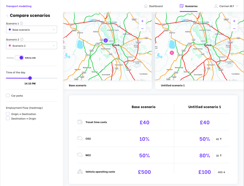
Once a scenario has been simulated, the results are sent back to the UI for visualisation. The data is displayed in the UI using the map region and through accompanying tables, to make the assimilation of complex information easier for the user. Custom scenarios can be compared with other custom scenarios or a base scenario for Oxfordshire, which is calibrated and validated against mobile network data. These comparisons allow users to understand how their proposed changes will affect Oxfordshire across various different metrics and at different times of the day. Scenarios can be visualised using side-by-side maps and tables, or by overlaying the data onto a single map.
One of the main concepts with the design of the user interface is that it must be kept simple and intuitive so that users without modelling knowledge can use the tool quickly and with ease. Emphasis was placed on streamlining the design and flow of the UI making navigation and insight; a quick and simple process with no prior knowledge of the tool.
A lot of data is displayed in the interface and the way colour is used in the UI is important. So that users are not overwhelmed, neutral colours, such as white and greys are used for a lot of background information. Key information is pulled-out from the background with bold colours, allowing users to quickly assimilate the important information and see what they have edited. For example, users can select the Time of day and see the Travel time cost straight away as they are highlighted in bright purple. Key data is also shown in larger font than background information.
Making the UI accessible was another major consideration in the both design of the workflow and visual design. The UI designs draw on the government’s design principles for accessible websites. For example, symbols are used in the UI alongside important colour choices to ensure that users do not have to rely on colour alone to infer meaning from the UI, and there is an important contrast between key information and the background.
Using page formats that users will be familiar with and positioning common functions (such as login buttons) where users would expect them to be on most websites, helps users navigate the UI. As the user moves between pages, the formats and button hierarchies remain consistent, maintaining the ease of use. For example, having a call-to-action button in the same place on every page which takes users to the next step of the user journey helps users progress through the scenario setup more quickly. All these design choices ease cognitive strain and provide a more pleasant user experience.